Live directions
The Almanac
The neighbourhood-keeper. "I don't sell houses — I introduce people to streets." Field notes, ledger stats, a multi-region almanac. The most distinctive, most opinionated direction.
Open the AlmanacSaaral · சாரல்
Tamil for light, fine rain. Quiet Tamil-Canadian rootedness for a diaspora-heavy market — bilingual, understated, patient. Strategically unique; no brokerage template offers this.
Open SaaralFive Wards
Real estate organised by ground. Pick a ward and the whole page re-routes — listings, stats and the calculator's tax rules all follow. The best expression of the multi-market strategy.
Open Five WardsQuiet Hours
Restraint as the statement. Near-mono and dark, one brass accent, oversized type, almost no chrome — with moody architectural photography and light that moves with the scroll. The anti-portal.
Open Quiet HoursThreshold
A field guide to character homes. Magazine grammar — masthead, drop-cap, pull-quotes, full-bleed photography, and listings presented as a scrolling folio spread. Warm, editorial, human.
Open ThresholdOLI · ஒளி
Hyper-white gallery. The page disappears to pure white; homes hang on the wall like living artworks, with all the colour in the imagery. Museum captions, lot numbers, vibrant motion that barely breathes.
Open OLITHIRA · Θήρα
Blinding white, one deep Aegean blue, hard noon light — the anti-Threshold. The layout breaks too: a village-path scroll, cobalt sky-breaks, listings set on a hillside. Greece, translated to her Ontario market.
Open THIRAClient build — Suba Aynkharan / RE/MAX Community Realty
A real client engagement. DAYLIGHT PRO is the chosen, production-bound direction; the other four are the alternates she considered, kept live for comparison. Same functional skeleton as the portfolio directions, wearing real names, brokerage and her GTA-corridor & Bay of Quinte regions.
Daylight Pro
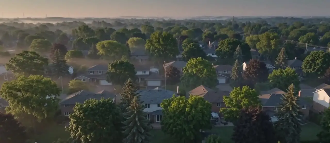
The approved build. Warm daylight editorial — street-level hero, a foyer-to-living video walk, the full skeleton wired to her real regions. This is the direction going to production.
Open Daylight ProDaylight Vista
The same daylight bones, turned up — a vivid, warm palette and a bolder entrance hero. The most saturated of the alternates.
Open Daylight VistaDaylight Aura
Daylight with a quieter pulse — gentle ambient motion through the hero and reveals. Movement you feel more than notice.
Open Daylight AuraLumen
The technical cut. "Real estate, reimagined" — interactive, light-driven, a cooler and more app-like hand on the same content.
Open LumenQuinte
The editorial cut. Leans into the Bay of Quinte corridor — calmer, magazine-paced, photography-forward storytelling.
Open QuinteIn the bank — design directions ready to build on request
The Standard
Conventional, trustworthy, expected. Brand red as a real accent, tidy listings grid. The safe baseline.
Call to buildConcierge
Premium-service framing, soft serif, generous whitespace, red dialled to a thin accent.
Call to buildThe Ledger
Numbers-forward, honest-broker. The calculators are the hero — closing-cost and LTT front and centre.
Call to buildOpen House
Built to capture: front-loaded lead magnets, sticky CTAs, the four lead actions everywhere.
Call to buildThe Desk
The site as a tool, not a brochure. Dashboard-ish; calculators and CMA feel like a software product.
Call to buildA fresh one
Like a concept but it's taken? Each agent gets a cousin, never a clone — a fresh direction designed from scratch.
Call to build